A brand new web site is here with a much needed refresh. Apart from the new design, here is what we've improved.
Your testimonials speak for themselves
Since we have received really awesome testimonials from timetablers around the world, we wanted them to be seen on our home page. Overall, timetablers who had previously used different school scheduling software for years were pleasantly surprised by our solution and sent emails to express their positive impressions. As it turned out, they managed to leave behind more well known scheduling software in favour of Prime Timetable. We would like to thank all of you who supported our software. That means the world to us.
Timetabling features explained
Some of the best and most used timetabling features are presented on the home page. In order to show better what's in the Prime Timetable box we have added a couple of new features pages where timetablers can easily understand the possibilities of our software explained in no more than a few sentences.
Plans and pricing simplified
We are trying to keep our offering as simple as possible, so our plans and pricing page follows that model. All bullet points for every plan are now more clearly explained with a tooltip next to each one. If your organization is specific and doesn't fit into basic or premium plan, then contact us about special pricing and offers for you.
Spread the word!
A new "Spread the word" section is added in the footer of every web page, where you can like us on Facebook, share a link on Twitter, Google Plus or LinkedIn.
The main reason why we did a makeover is to present our timetabling services more clearly and user friendly and we hope that you will share https://schedulty.com/ link with other teachers, principals, colleagues, and others. Your help will be much appreciated! Enjoy the new web site and let us know if you like this version better than the previous one.
In the recent version of Prime Timetable we have added Preview new version option in main menu. Clicking it your current timetable will be opened in the upcoming Prime Timetable 2.0.
Here is the short list of what's new in Prime Timetable 2.0:
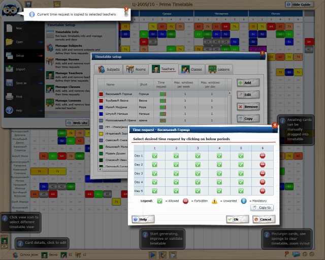
- Instead of ribbon, there is only a school board with instantly available tools on board frame leaving more space for your timetables.
- There is a new optimized menu when you click the owl in the top left corner.
- New interactive board tools: Pin, Sponge and Zoom which make timetabling more fun.
- New Help -> Options where you can configure application as best suits your needs.
- User interface is redesigned and more natural with curved lines and nature associations (e.g. form background looks like a piece of paper).
- There are lots of animations which make application smoother.
- Performances are increased. For instance, timetable view is rendered much faster in larger timetables.
All these changes make timetabling faster, easier and more fun.
Welcome aboard, exciting times for timetabling! There are some great improvements that we would like to share with you. In the upcoming version of Prime Timetable we are introducing a new visual element – good old school board which should replace the ribbon. Instead of ribbon, there is only a board with the owl in the top left corner. Clicking the owl brings main menu, while other timetabling tools are placed around the board frame and are instantly available.
Previous ribbon design had around 30 options for clicking on startup screen, which made software too complicated for timetablers. With new design the number of options is reduced by half making it clearer and easier to use.
Furthermore, by maximizing timetabling space, timetables are easy to use even on the netbook.

Screenshot using school board